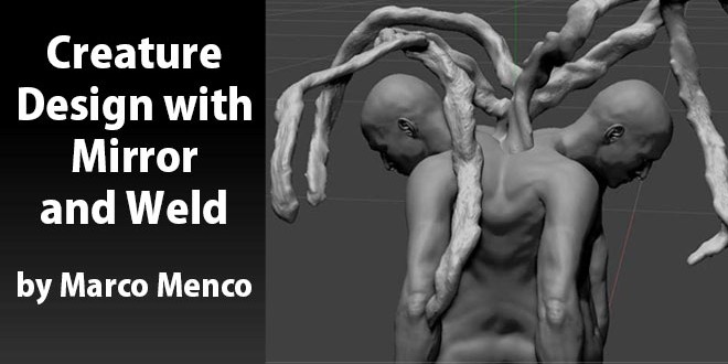
Creature Design with Mirror and Weld by Marco Menco
In this little tutorial we are going to see how easy is to design creatures or art using “mirror and weld” tool in ZBrush.

Here Marco Menco starting with a generic human body that he built before using a bit a Maya and of course ZBrush. He is moving forward with the idea of creating something new out of a model that he already have concepting with the idea of duality in the human character’s life. So just with this this two simple components to start a concept work, we’ll see how easy is to build something quite unique using some new tools.

First thing would be posing the model. He is using Transpose and Rotate. He enabled the Floor in the Draw menu so that the origin of axis is visible. Tweaking the Grid size and the Tiles would be helpful to be able to have the axis visible at the size he need. This step is quite important in order to establish how much of the original model will be mirrored. So having the model partially in the negative part of the grid will mean that we will lose that part and we’ll see the mirrored model starting at the origin to negative infinite.
Once he was happy with the position, He got rid of the lower resolution so that it would be possible by ZBrush to handle the creation of the new polygons in the welt area. You might want to think about the polycount at this point. You don’t want to end up using your highest density mesh because that will be almost doubled once you hit the button “Mirror And Weld”.

Then hit the button. The first thing you’ll notice is that the mirrored model just looks like it has been duplicated and mirrored because the weld part is very sharp so the two models look like crashing into each other. So smoothing the weld edge is something you wanna do in order to have a nice intersection. He also did some filling with the clay brush to achieve more organic feeling.

Using the clay brush will help you to design a nice transition from one model to the other and to have a more organic and soft feeling of the skin. Now that we have this new shape, it already looks like something you want to start detailing. At this point He just thought that He could go further with the concept… so He already got represented the dualism… so some “life” is needed… He thought that having the shared spine growing out from the top and becoming something like a tree would be an idea. You won’t see the final result here but just some sketchy model from whom he could start developing the idea. So what’s better than ZSpheres2 for some fast visualization!?

He started with appending one ZSphere and He positioned it at the root, between the two character’s shoulders. Having the ZSphere is necessary in order to start ZSketching. So after He positioned the ZSphere He switched to ZSketch mode by clicking shift+A on his keyboard. This way the ZSphere turns into grey shaded sphere (it will use the material you have selected at that moment). Then He went to the Brush menu and selected the Armature brush and start playing around. The next step would be to put some shapes onto this armature and that would happen by using the ZSketch brush. He used ZSketch2 because it kind of gives me enough volume that He can always smooth later on. So after having done some organic shapes on the armature He generated a unified skin that had enough density to keep most of the shapes He put there..


Once He had the unified skin He used the “GroupsLoops” in the Tool>Geometry. This is a new feature in ZBrush that organizes better the flow of polygons by drawing nice edgeloops around the polygroups. This way He have this wood/node organic feeling on those branches.

Then He used the Noise brush and by tweaking the brush placement in Brush>Depth He was able to obtain that kind of details he was looking for.


 zbrushtuts Zbrush Tutorials, Art and Breakdowns


