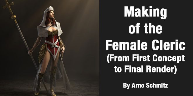
Making of the Female Cleric – From First Concept to Final Render By Arno Schmitz
ARNO SCHMITZ is a Character Artist from Amsterdam, Netherlands. In this post you will see Making of the Female Cleric : From First Concept to Final Render By Arno Schmitz.
Software used: Photoshop, Maya, Mudbox, Mental Ray
Initial Idea
The first idea taken into consideration was that this character could live in the same world as my previously designed character. Influenced mainly by Christian religion and the Vatican, a holy warrior was created. She is not a “one man army”; instead her focus lies on protecting her fellow combatants. A function that would fit well with her look and theme. To capture her purity it was decided to make her an attractive young girl. She has stunning red hair to indicate that she is a fierce warrior; red also fits well with the slightly transparent white robes that make up the majority of her costume.
Contrasting the Designs
Since both her and my previous character, The Lightning Mage, live in the same world and will finally meet each other, it was important to create contrast between both their function and appearance. Although the Chinese mage is not evil, his body has clearly been corrupted by his power. The mage’s clothes are worn down heavily, and his body is abused in contrast to the physical beauty of the young girl and her clean white clothing. Even the tonal values of the two characters are made in contrast to each other (Fig.01).

Fig.01
Character Profile
For those who are interested I have included the character profile below. This is a sheet of questions you can ask to help define who the character you are creating is. This is a good start for designing, or a method to help you get ideas when you are stuck. You can always fall back on this when you are looking for new ideas or ways to unify existing ideas.
The Design Process
The design process is a chronological description of the steps taken to get from the initial idea to the final design
(Fig.02).

Fig.02
The original idea was to create a brute warrior type. This was abandoned; instead the focus was redirected to create a holy warrior. This change allowed for a much more interesting design, and opened up an entire new window of reference to draw inspiration from. This also gave much stronger motivation for her to be a soldier; instead of bloodlust, she now fights for justice and the survival of the church.
Giving her a pure character, it was justifiable to give her a young, beautiful and unblemished face (Fig.03).

Fig.03
For the costume, two main sources of reference/influences were used: catholic robes were mixed with Victorian dresses to get the final look for this character. The few plates of armour copy the detailing of the Victorian dresses. The shoulder plates covered by the amice were added to increase the “crusader” feel (Fig.04).

Fig.04
In Fig.04 you can clearly see the excessive use of rich materials in the catholic clothing. The use of gold is very apparent and is adopted into the design. At first the idea was to give the plating a metal colour, but gold fitted the theme better and increased the holiness of the character (Fig.05).

Fig.05
The Victorian details fitted in very well with the Catholic details, but the overall form was much more feminine and exposing. Things like corsets were adopted from this style into the character design; this gave the character a younger and more feminine look.
In Fig.06 you can see some of the full body designs for the character. When creating the full body designs, appropriate detail images are usually also created at the same time. In this stage you need to determine if all the elements flow correctly with each other, and see how the clothing affects the visual proportions of the character

Fig.06
The detail sketches you can see in Fig.07 are mostly influenced by Christian symbols. For things like gloves and boots, many variations were made in an effort to find the balance between plate armour and cloth. The embroidery on the cloth is based on Victorian designs, and the plating has Victorian leaves and birds included in them. A golden dove holds the bust together, and the hip plates have an eagle head incorporated into them.
Fig.07
Colour Choice
For this character, a minimal colour palette was used: red, white and gold for the character, and gold and silver for the weapons. Some exploratory sketches can be seen in Fig.08.
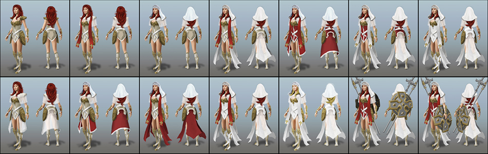
Fig.08
It is a great advantage to be able sketch in colour, and being able to change colours quickly. I tried to really push the white in some instances to emphasize the holy aspect. But when there were too many white elements the character looked more like a bride warrior then a holy warrior.
The final colour palette has the following philosophy behind it: She is a young and fierce warrior, very passionate and protective in battle. This is represented by the colour red and is the core of her personality and her costume. Besides that, she represents the holy church and is a pure person. This is represented by the colour white, and is mainly used on the extremities and as accents. This leads to a character with a fierce red core and a holy white protective halo. Something that precisely describes her personality (Fig.09).

Fig.09
Armour Representation
Since this character is meant to be a RPG game character she will have different items and clothing during the game. Three armour sets were created, each representing a group of progressively better armour pieces. Light armour represents items such as robes and leather armour; medium armour represents items such as chain mail and scale male; heavy armour represents all types of plated armour (Fig.10).
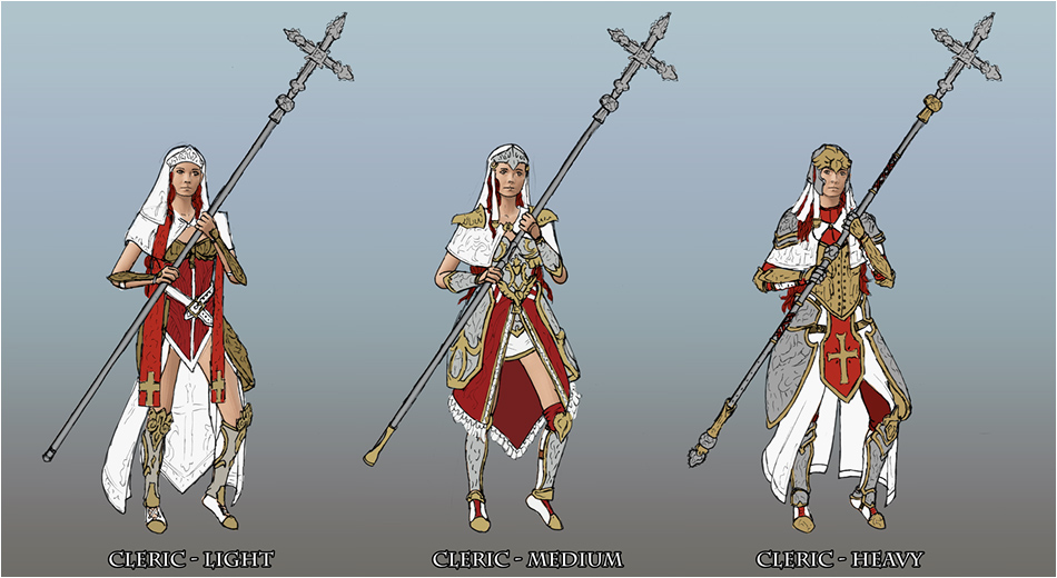
Fig.10
The focus for this project was only the light armour, but starting points for the other armour levels were created so I had an indication of how this system would work.
Symbols Explained
The small bird sculpture on the chest piece represents a dove. This animal was chosen because a white dove is a symbol for peace, which is something that fits well with the message of the church. The main motif on the large plates is an eagle head, which was chosen to compliment the dove because it is a larger and more aggressive bird.
Holy crosses are used to represent the church, and are used on the staff and on some of the larger pieces of fabric.
Victorian filigree is used on the boots and as detail on the plates, sometimes mixed with Christian filigree. The flowing shapes give a more elegant and feminine design.
Finishing the Concept
For this design, two types of concept art were created: the main image that shows the cleric in a front and back three-quarter view, and an orthographic sheet containing the front, side and back view of the character (Fig.11).

Fig.11
The orthographic sheets in Fig.12 contain the true information about the shapes of the character. The character might appear a bit bloated; the reason being that, the actual orthographic views of the base mesh were used as the basis. Sometimes when artists draw these sheets by hand, they use some kind of perspective in the orthographic sheets, which is wrong, and will result in a thin model. This has to do with the foreshortening of cylindrical shapes in perspective.
All the sheets use neutral light to give a clear indication of colour and material types. There are multiple sheets, each showing a layer of the costume, so that no part is obscured by another part of the costume (Fig.12).
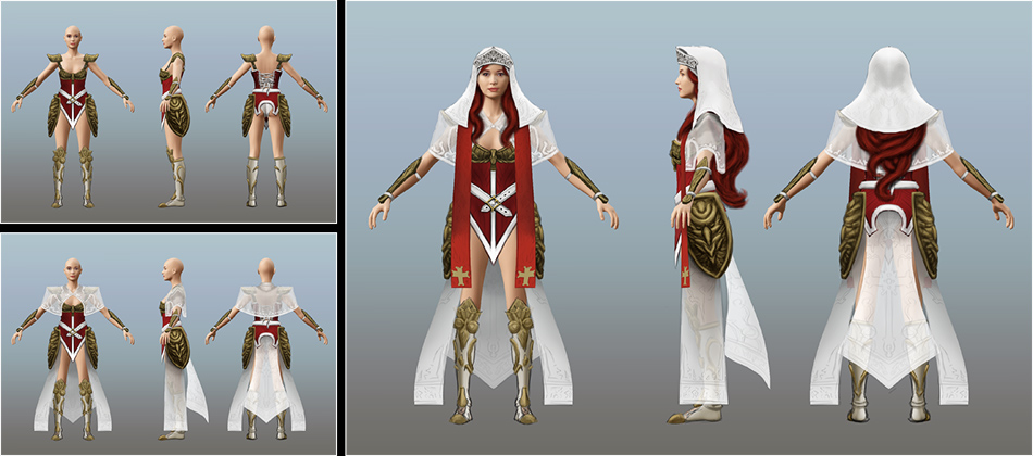
Fig.12
Taking it into 3D
The overall workflow was very standard. I already had a base mesh that I used to help me concept in 2D. This mesh served as the starting point for the modelling process. I aligned all the orthographic sheets in Maya, and modelled all the costume parts around the base mesh. All hard surface parts were refined in Maya, while more organic parts of the model were taken into Mudbox to be sculpted. The body and especially the face also underwent a heavy sculpting pass in Mudbox (Fig.13).
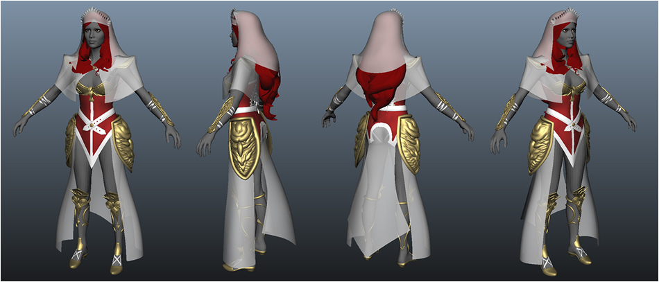
Fig.13
The aim was for the final model to be of cinematic quality, with a polycount of 231,196 triangles; it’s still manageable to work within Maya while giving the impression of a really high polygon model. After the UV’s were done, all the sculpted information was baked down using normal maps.
Texturing was done in Photoshop. Mudbox was used for projection painting. Fig.14 shows a few examples of finished textures sets. The top row shows the diffuse/colour maps, the middle row the specular maps, and the lowest row shows the normal maps.

Fig.14
These textures were tweaked to work with my shaders, which were fairly simple in most cases. Phongs and blinns were used for a lot of the common materials. mental ray’s fast miss_fast_skin_maya shader was used for all the skin. Mia_material_x_passes shaders were used to get a nice scattering effect on the white robes by enabling translucency. The mi_car_phen_x_passes shader was used to create a more convincing gold look for all the armour plates (Fig.15).

Fig.15
Posing was achieved by rigging the character in Maya. Soft skinning was used for all the organic parts, and all hard surface parts were simply parented to the bones. nCloth allowed all the flowing fabrics to be draped nicely over underlying parts (Fig.16).

Fig.16
The character was posed in a variety of different poses to find the one that best represented the character. My test case, just like with the lightning mage, was to recreate my concept art in 3D. This meant reproducing the pose, lighting, etc., and taking it a step further than was done originally in the concept. A comparison can be seen in Fig.17
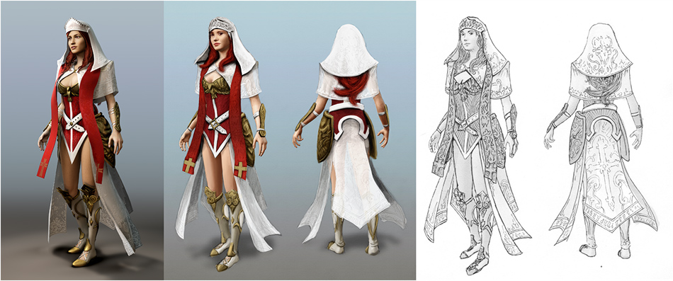
Fig.17
Once confident, I experimented with more sophisticated poses. In the end I choose to do a contrapposto (“counterpose”), which is a pose used a lot in classical art where the figure puts his or her weight on one leg, called the standing leg. Since I had drawn these types of poses for a year now I was familiar with their characteristics. The cross was added to add some more implied story to the character, and also to give her something to balance on. The face is looking away on purpose; the idea was that she was looking at a church window in the distance. A floor and back wall for the church were modelled to give the entire scene better context (Fig.18).
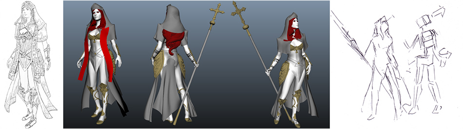
Fig.18
Rendering was completely done in mental ray. My lighting setup was fairly traditional: I used a key, fill and two rim lights (all mental ray area lights). Final Gather was used to add additional bounce light into the scene. An HDR image of a church interior was used to cast the final gather, and be reflected in the metallic parts of the character (Fig.19).

Fig.19
The lighting was split up into multiple passes; diffuse, specular, reflection and bounce light were all separated to have greater control in post. Helper maps, such as material ID maps and a depth map, were also rendered out (Fig.20).

Fig.20
Post-work in Photoshop
In the end I composited the main layers (diffuse, specular, reflection and bounce light) in a very straightforward fashion: I just used Linear Dodge to add them on top of each other in Photoshop. Only the bounce light intensity was lowered to give a better sense of direct light coming through the window out of frame.
The depth map turned out to be invaluable in controlling all the atmospheric effects, and really making all the 2D effects integrate nicely with the 3D objects. Fig.21 shows the image going through some of the steps to get to the final image.
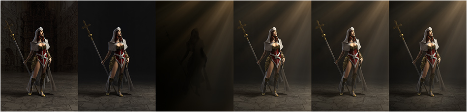
Fig.21
After that, it was just a matter of cropping your image nicely and colour correcting it. In Fig.22 you can see the resulting final image. One of my biggest lessons learned from the last project that I took into this one is to always render big enough. If you ever want to make a nice print from your work you don’t want to have to go back and re-render everything at higher resolution and redo all your post-effects in Photoshop.
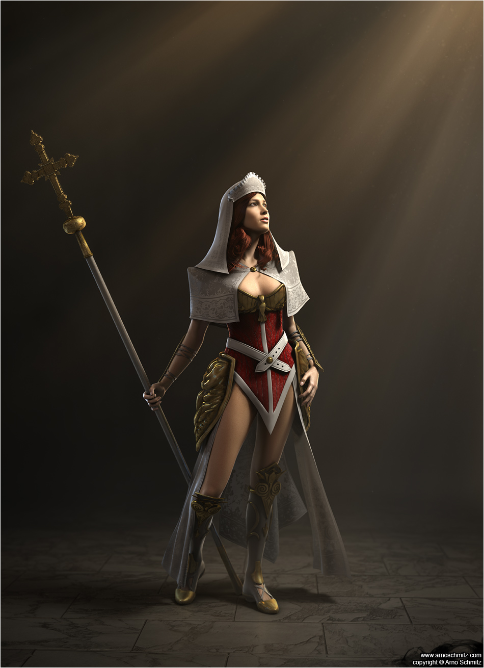
Fig.22
Appendix, Sketches and other Images
Below the sketches and images made during this project in roughly chronological order.
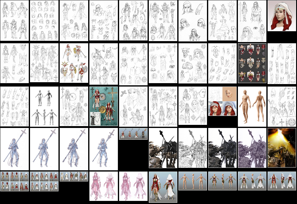
Fig.23
Website: http://www.arnoschmitz.com/
3d art, zbrush, zbrushtuts, cg art, 3d modeling, zbrush sculpting, zbrush tutorial, tutorial zbrush, zbrush tutorials, tutorials zbrush, free zbrush tutorials, tutorials free zbrush, free zbrush